ARTNEWSPRESS: The devil of any Quentin Tarantino movie is in the details, and that’s truer than ever when it comes to Once Upon A Time In Hollywood. The auteur’s ninth film celebrated Los Angeles’ past with incredibly accurate recreations while also reimagining some of its darker history, and audiences reacted remarkably well.
With the digital version of the film being made available and 4K, DVD and Blu-ray packages arriving on December 10, Sony Pictures Home Entertainment showcased some of the gorgeous costume pieces for members of the press. Designer Arianne Phillips was on hand to share some of the film’s costuming secrets, including how Sharon Tate’s family helped shape Margot Robbie’s onscreen look and which items best identified Rick (Leonardo DiCaprio) and Cliff (Brad Pitt).
Are there any seemingly small or insignificant costume pieces that really helped build the world of Once Upon a Time in Hollywood?
Arianne Phillips: The details are always really important for me in the costumes. They help create layers in the character. They also help, I hope, assist the actors in becoming that character. So, there are some details – for instance, this medallion which I had made, there’s an R for Rick and kind of a Tudor rose pattern. I was inspired by the idea of that Steve McQueen, bad boy kind of thing. The person that has monogrammed clothes has a bit of an ego, bit of bravado; I love that for Rick.
For Cliff, we have this stuntman buckle. Sometimes when I’m working on a film, incredible magic will happen, where I’ll find a piece of costume that is like a talisman for that character. I was rummaging at Warner Brothers Costume, looking for belts, and I came across this belt buckle that says, “Stuntman’s Association Member.” I think it was [from] 1965 onwards. These belt buckles were something that, if you were a stunt man, you could get you could have made for you or have ordered through the Stuntman’s Association. This became like a eureka moment for Cliff, and I was so excited. Luckily, Brad Pitt and Quentin were both really enthusiastic as well. And he wore this belt buckle with all his costumes, so that was kind of the Cliff Booth talisman.
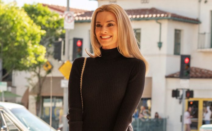
And then for Sharon Tate, for Margot Robbie, we had the great good fortune of having Debra Tate as a consultant on our film. And Debra was generous enough to show me Sharon’s clothes, some of her jewelry, her sunglasses – and just be able to touch and feel those really [helped]. There’s an osmosis, I think; there’s a reverence and a responsibility that I felt as a costume designer in recreating who Sharon Tate was. To be able to have anecdotes and stories from her sister about who she was is really important for me.
Debra showed me some of her costume jewelry, and I asked if there is any way that we could possibly borrow a couple of pieces to use in the film. It was unremarkable; it wasn’t particularly amazing jewelry. It was just a few bits and bobs that had been left over from years of holding on to Sharon’s stuff. And Debra was generous enough to loan it to us. The whole film, she’s wearing a ring or an earring that belonged to the real Sharon Tate.
Details like that, which might really inform the actor and act as a kind of beam-me-up to help access that character, are my responsibility as a costume designer and just as important as all the visual clues that costumes serve for the audience at large.
Did you primarily track down 1960s items, or did you have to craft many yourself?
Arianne Phillips: As a costume designer, my first job is the research part. We had to dress hundreds of people in the background for this movie, so we amassed a lot of clothes that would have existed from that era. Even though it’s 1969, I’m looking at clothes back to the late 50s. Because if you see an older person on the street, they’re not necessarily wearing something they bought in 1969. And I want to show the change, so I hunt and gather, along with my great team of people who work with me, vintage clothes from costume houses to vintage stores to dealers.
But in the end, for the principal costumes, most of them are designed and made. And I used the vintage pieces as inspiration in the early fittings, but then we ended up designing and making them and a lot of the vintage clothes I use on the background. And it’s a huge effort; I have a lot of people in my department – 10 to 25 people at any given time.
How did the iconic Hawaiian shirt come into being?
In Quentin’s script, it was scripted that Cliff Booth wears a Hawaiian shirt. Hawaiian shirts are kind of part of the Quentin Tarantino vernacular; we’ve seen them before in other iterations of his films. So, I knew that this needed to be unique to Once Upon A Time in Hollywood.
So, I looked at every imaginable vintage Hawaiian shirt you can imagine. And in the end, I was inspired to make the shirt, which is based on a similar vintage shirt that I had seen. But we changed the pattern to be not a Hawaiian motif, but an Asian motif with the Hawaiian shirt cut, just to keep it in its own world. I used a lot of yellow in this film. For me, yellow really represents California. It’s color that was very commonly used in the 60s, and it looked particularly good on Brad Pitt.
Cliff’s moccasins in Once Upon A Time In Hollywood seem to distill his essence. How did you choose which ones he would wear?
Arianne Phillips: I read a quote when I was a young person, where Laurence Olivier said he always started with his character from the shoes up. We all know what it’s like to wear a pair of shoes that make us feel good and strong, and we also know that it’s like to wear a pair of shoes that make you feel not safe or not yourself. I took that to heart. for costume, I feel like a character starts with the shoes. And that’s how we get the balance of the silhouette. You can really tell the difference between Cliff Booth and Rick Dalton by their shoes.
Rick Dalton wears cowboy boots when he’s not working. He wears them because they’re cool, and they give him – I think when you imagine the feeling of wearing cowboy boots, it makes you feel kind of like a badass. Tough, strong, protected. And it’s a pair of boots he probably would have worn on Bounty Law or Lancer, so it’s part of his persona.
Cliff Booth, on the other hand, we were quite inspired by the Tom Laughlin character Billy Jack, which is this kind of denim on denim thing. The idea of him wearing moccasins was just badass in a different way. It’s total confidence to wear a soft shoe like that. If you think about the scene with him and Bruce Lee, knowing how confident he was and what a badass – and, of course, there’s this terrible rumor that he killed his wife. I felt like there’s a dangerousness in wearing moccasins. He doesn’t have to prove to anyone that he’s a tough guy; he’s a stuntman who throws himself off buildings.
I loved the vulnerability and the strength it would take for a person to wear moccasins. And also, it’s a little hint that Cliff is aware of what’s going on. Moccasins were something that the hippies were wearing and young people were wearing, and it also goes to his silhouette of being casual and being very comfortable in his clothes. So, that’s the thinking behind that.
How did you decide on the color palette for the costumes?
Arianne Phillips: Well, a lot of things influence the color palette. The reality, and I thought a lot about Robert Richardson’s cinematography. He has such a long, incredible collaboration with Quentin. A wonderful thing about working on a film with Quentin Tarantino for the first time is I had reason to go back and rewatch everything, which I did. I really especially paid attention to Bob and Quentin’s language together, and what colors look like through Bob’s lens essentially.
And doing research on clothes at that time, and what colors people wore. We have a tendency in modern dress to wear darker colors – people wearing a lot of browns and yellows and oranges – and reflecting the California of it all. The meticulous work that Barbara Ling did, from the signage to the production design, recreating Hollywood Boulevard. Thank God we did that at the beginning of our shooting schedule, because that was so inspiring for me, looking at what those colors look like at night
As a designer, I always start with color and silhouette. There are a few colors I usually stay away from as a designer, because I don’t find may translate well digitally. Like green and red, I think, are really challenging for me. They never really seem to have the same integrity with the naked eye as they do on film, or they vary so much.
With one exception: I did design the robe for Rick Dalton in red. We had looked, trust me, at a ton of different colors and we went back to red. I created a backstory about this robe, that it was perhaps something that Rick had gotten on a tour to Hong Kong or Tokyo, or someone had given him as a gift – Bruce Lee. So, we went for the traditional Chinese red.
https://screenrant.com
TATIANA HULLENDER


![’21 Bridges’ Producers the Russo Brothers Want to Keep Challenging Themselves in a Post-‘Avengers: Endgame’ World [Interview]](https://artnewspress.com/en/wp-content/uploads/2019/11/russobrothers-monitors-headphones-700x326-100x70.jpg)